Can You Read Me Now?
I wanted to use 16px text on this site, because anything smaller than that felt a little uncomfortable on the iPad – and what’s the point of a responsive design if you feel like you have to zoom in? I was a little reluctant to do it, however, because 16px felt awkwardly large on the desktop.
Fortunately, I happened across a couple of great articles by Oliver Reichenstein and Wilson Miner which convinced me it was the right thing to do.
I won’t repeat everything they wrote, but here’s the gist of it: We’re used to seeing small font sizes on the web because that’s how we’ve always done it. Screen resolutions used to be much lower, and smaller text allows you to fit more of it on the page.
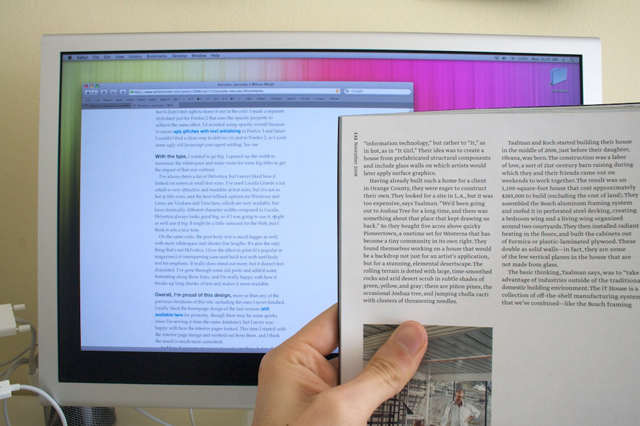
We squint and lean in close to our monitors without thinking about it – but it shouldn’t have to be that way. Here’s a picture Wilson took of 16px text next to a magazine held at reading distance:

Using larger text can be a challenge, and it may not be feasible on every site, but it’ll force you to create simpler and cleaner designs. So give it a try, lean back, and you might soon begin to find that everything else looks too small.
