Faking Mobile Design
There are a number of WordPress plugins out there which purport to automagically create a touch-optimized version of your site.
“Make your blog look beautiful on tablet web browsers in under 3 minutes.”
“Automatically adds a mobile verion of your site.”
“Automatically transforms your WordPress website into an application-like theme, complete with ajax loading articles and effects when viewed from the most popular mobile web browsing devices.”
“Shows an interface designed for a mobile device when visitors come to your site on a mobile device.”
If you’re using or abusing one of these plugins, it’s time to stop.
I come across these sites from time to time and it’s always a poor experience. They try to fake native app conventions and usually do a poor job of it, while simultaneously making it harder to get to the content, breaking the principal of content first/navigate second.
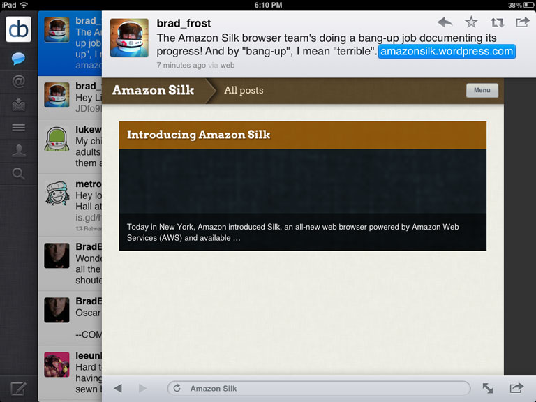
Some of them (~cough~onswipe) have even made the cardinal mistake of assuming that they know how big my iPad is. So when I visit a blog from inside the Twitter app or an RSS app, which gives me a much smaller viewport, I run into trouble fast.
There’s actually a link at the bottom of the page to switch to the normal site, but I can’t see it or get to it. It assumes I’m using the full-height Safari browser – in which case the link would fit – so scrolling is disabled. Nice. Oh, and what’s up with the black bar on the right?
Articles in full-screen-sized modal windows? Oh yeah. I’m having a real tablet experience now. Sure wish it would let me scroll to the bottom of this article. Let’s try Safari instead.
Because it wouldn’t look like a mobile app if there wasn’t a nav bar with a button in it. But ahh, there’s the link at the bottom I was looking for.
Finally.


